Reading List
The most recent articles from a list of feeds I subscribe to.
CSSNinja's custom forms revisited to work with CSS sprites
I read today CSS Ninja’s (Ryan Sheddon’s) brilliant new technique about the creation of custom checkboxes and radio buttons with CSS alone.
The only thing that bugged me about it was something he pointed himself out as well:
This technique has only 1 drawback I can think of, IE support is not a drawback for me, you can’t use a big sprite image to save all the radio and checkbox states, they need to be individual images. Using CSS generated content to insert an image doesn’t give you control of the image position like a background image does.
And then I wondered “but hey, why can’t we use background images?”. It seemed pretty obvious to me that we could combine a transparent text color with normal css sprites and a display of inline-block in the ::before pseudo-element to achieve the exact same effect. I verified that my initial assertion was actually correct, and tested it in Firefox, Chrome, Safari and Opera (the latest only, no time for testing in older ones at the moment) and it seems to work fine.
Here it is: demo | source files (including .psd file of the sprite)
I’m afraid there’s some blatantly obvious drawback in my approach that made Ryan prefer his method over this, but I’m posting it just in case…
iPhone keyboard with CSS3 -- no images
Yeap, this is yet another of those things that make no practical sense but are fun to make just to see whether it can actually be done. It’s also a proof of the fact that when I have too many things to do, I tend to procrastinate more. :P
Here it is (resize the window to get the narrow version ;)):
http://lea.verou.me/demos/iphone-keyboard/
It should look correct in Firefox 3.6, Chrome 4 and Safari 4. It looks best on Firefox 3.6 due to it’s ability to render subpixel distances, whereas other browsers just round everything to the closest pixel. It also looks best in computers with Helvetica installed (it’s installed by default on macs btw) but it should look sufficiently OK with Arial too, since it’s a rip-off of Helvetica ;) (the only problem with Arial is that the line-height of the buttons with the symbols will be slightly different since the custom font’s measurements are based on Helvetica Bold) Also, ironically, it doesn’t look ok in the iPhone!
For those of you that don’t use one of the aforementioned browsers as your primary and are way too bored to switch (or don’t even have them installed (!)), here are two screenshots from Firefox 3.6 (nicely cropped to only contain the keyboard):

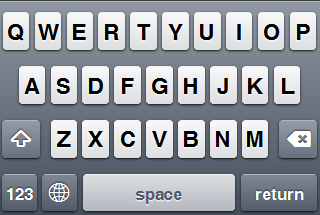
As for how it’s done, as you can easily see, most of it is run-of-the-mill for someone with a decent grasp on CSS3: media queries, CSS gradients, shadows, border-radiuses and RGBA. The only tricky part is the symbols for shift, backspace and international. I have to admit I cheated a bit here: I didn’t use images, but I used @font-face with a custom font that just contains these 3 symbols. The reasons behind that are that this way I wouldn’t have to create 2 versions of the symbols (light and dark, for pressed and normal states respectively) and that they are vector, so they scale (try zooming in).
Please note that there’s no functionality attached to it. It’s just an interface. I wasn’t interested at making an on-screen keyboard in general, I was just interested to see if a keyboard visually identical to iPhone’s is possible with CSS alone. If someone wants to actually use it and/or develop it further, you’re free to do so, as long as you keep the comment at the start of the css file. ;)
An interesting discussion about this could be “What would be the ideal markup to semantically style a keyboard?”. Personally, I just paid attention to the more pragmatic objectives of making the keys focusable, and keeping the complexity of the DOM tree to a minimum, so you might find it semantically wrong (I used a <ul> for the container, <li>s for the rows and <button>s for the keys) – but what is right actually in this case? Is a keyboard a list or a table of keys? I don’t think so…
iPhone keyboard with CSS3 -- no images
Yeap, this is yet another of those things that make no practical sense but are fun to make just to see whether it can actually be done. It’s also a proof of the fact that when I have too many things to do, I tend to procrastinate more. :P
Here it is (resize the window to get the narrow version ;)):
http://lea.verou.me/demos/iphone-keyboard/
It should look correct in Firefox 3.6, Chrome 4 and Safari 4. It looks best on Firefox 3.6 due to it’s ability to render subpixel distances, whereas other browsers just round everything to the closest pixel. It also looks best in computers with Helvetica installed (it’s installed by default on macs btw) but it should look sufficiently OK with Arial too, since it’s a rip-off of Helvetica ;) (the only problem with Arial is that the line-height of the buttons with the symbols will be slightly different since the custom font’s measurements are based on Helvetica Bold) Also, ironically, it doesn’t look ok in the iPhone!
For those of you that don’t use one of the aforementioned browsers as your primary and are way too bored to switch (or don’t even have them installed (!)), here are two screenshots from Firefox 3.6 (nicely cropped to only contain the keyboard):
As for how it’s done, as you can easily see, most of it is run-of-the-mill for someone with a decent grasp on CSS3: media queries, CSS gradients, shadows, border-radiuses and RGBA. The only tricky part is the symbols for shift, backspace and international. I have to admit I cheated a bit here: I didn’t use images, but I used @font-face with a custom font that just contains these 3 symbols. The reasons behind that are that this way I wouldn’t have to create 2 versions of the symbols (light and dark, for pressed and normal states respectively) and that they are vector, so they scale (try zooming in).
Please note that there’s no functionality attached to it. It’s just an interface. I wasn’t interested at making an on-screen keyboard in general, I was just interested to see if a keyboard visually identical to iPhone’s is possible with CSS alone. If someone wants to actually use it and/or develop it further, you’re free to do so, as long as you keep the comment at the start of the css file. ;)
An interesting discussion about this could be “What would be the ideal markup to semantically style a keyboard?”. Personally, I just paid attention to the more pragmatic objectives of making the keys focusable, and keeping the complexity of the DOM tree to a minimum, so you might find it semantically wrong (I used a
- for the container,
- s for the rows and
Redesign
Was about time, wasn’t it?
I wanted a simpler, more minimalistic (and wider!) theme for a while now. The other one was too restrictive. I had designed it when I had absolutely no content, and few changes were made to it afterwards.
So, today that I was too sad and furious to do anything productive, I spent a few hours redesigning the blog (creative venting…). Please note that it’s just a few hours’ work (with no mockup), so it’s bound to be a bit rough around the edges. I will refine it more as time goes by.
(and just like the previous one, it’s best viewed in more CSS3-supporting browsers, like Firefox, Chrome or Safari. If we can’t use the latest bells n’ whistles in our personal blogs, where can we? ;))
Here’s a screenshot from the previous theme:

R.I.P. my first wordpress theme.
PS: Yeah, I know I haven’t posted in a while. I have started lots of posts, but didn’t finish any. I hope I’ll have something complete to post soon.
Redesign
Was about time, wasn’t it?
I wanted a simpler, more minimalistic (and wider!) theme for a while now. The other one was too restrictive. I had designed it when I had absolutely no content, and few changes were made to it afterwards.
So, today that I was too sad and furious to do anything productive, I spent a few hours redesigning the blog (creative venting…). Please note that it’s just a few hours’ work (with no mockup), so it’s bound to be a bit rough around the edges. I will refine it more as time goes by.
(and just like the previous one, it’s best viewed in more CSS3-supporting browsers, like Firefox, Chrome or Safari. If we can’t use the latest bells n’ whistles in our personal blogs, where can we? ;))
Here’s a screenshot from the previous theme:
R.I.P. my first wordpress theme.
PS: Yeah, I know I haven’t posted in a while. I have started lots of posts, but didn’t finish any. I hope I’ll have something complete to post soon.