Reading List
The most recent articles from a list of feeds I subscribe to.
Easily center text vertically, with SVG!
These days, we have a number of different ways to vertically align text in a container of variable dimensions:
- Table display modes
- Flexbox
- inline-block hacks
- Wrapping the text in an extra element and absolutely positioning it
- …and probably many others I’m forgetting
However, often comes a time when neither is suitable, so here I am, adding yet another option to the list. Of course, it comes with its own set of drawbacks, but there are cases where it might be better than the existing solutions.
It all started when I discovered the text-anchor SVG property. It determines where the x and y attributes on <text> elements refer to. The magic starts when you set it to “middle”, then the x and y attributes refer to the center of the text. So, if you set those to 50%, they refer to the center of the SVG graphic itself, and if you set the SVG width and height to 100%, the text basically sits in the center of the <svg>’s container, which could be any HTML element!
One issue was that this centered the baseline of the text, so I tried to find a way to shift the baseline appropriately. Setting dominant-baseline: middle; on the `
In addition, this method has the following drawbacks I can think of:
- Extra markup (namely 2 elements:
<svg>and<text>) - If the text is more than one line, it won’t automatically wrap, you have to do it manually.
- Some new-ish CSS text properties may not be applied. For example, text-shadow is applied in Chrome but not in Firefox, since technically, it’s still not a part of the SVG spec.
- You need to duplicate the text color as a fill property, since SVG does not understand the color CSS property. No need to duplicate anything, just use
fill: currentColor;(thanks GreLI!)
However, it has a few advantages too:
- You don’t need to change anything on the parent HTML element
- Degrades gracefully in non-SVG browsers
- Should be perfectly accessible and won’t break SEO
- Works perfectly in IE9, unlike Flexbox
- You can include any kind of SVG styling on the text. For example, strokes!
You can see and play with the result in the dabblet below:
Verified to work in at least Chrome, Firefox, IE9+. Hope it’s useful, even though it won’t be a good fit in every single use case.
Preview corner-shape, before implementations!
As an editor of the Backgrounds & Borders Level 4 spec, I am naturally a bit more interested in the cool features it will bring, once implementations start (it’s currently too early for that). One of the coolest features in it is corner-shape. While in Backgrounds & Borders 3, border-radius was only used for rounded (actually, elliptical) corners, with the help of corner-shape, it will be able to do so much more! Beveled corners, scoop-style corners (informally known as “negative border-radius”), even rectangular notches.
Unfortunately, until it’s implemented in browsers, it’s hard to play with it. Or, is it? I spent the weekend creating an app in which you can enter values for corner-shape, border-radius, width, and height, and see the result, simulated through SVG, as well as the fallback in browsers that don’t support border-corner-radius (which is currently all browsers).
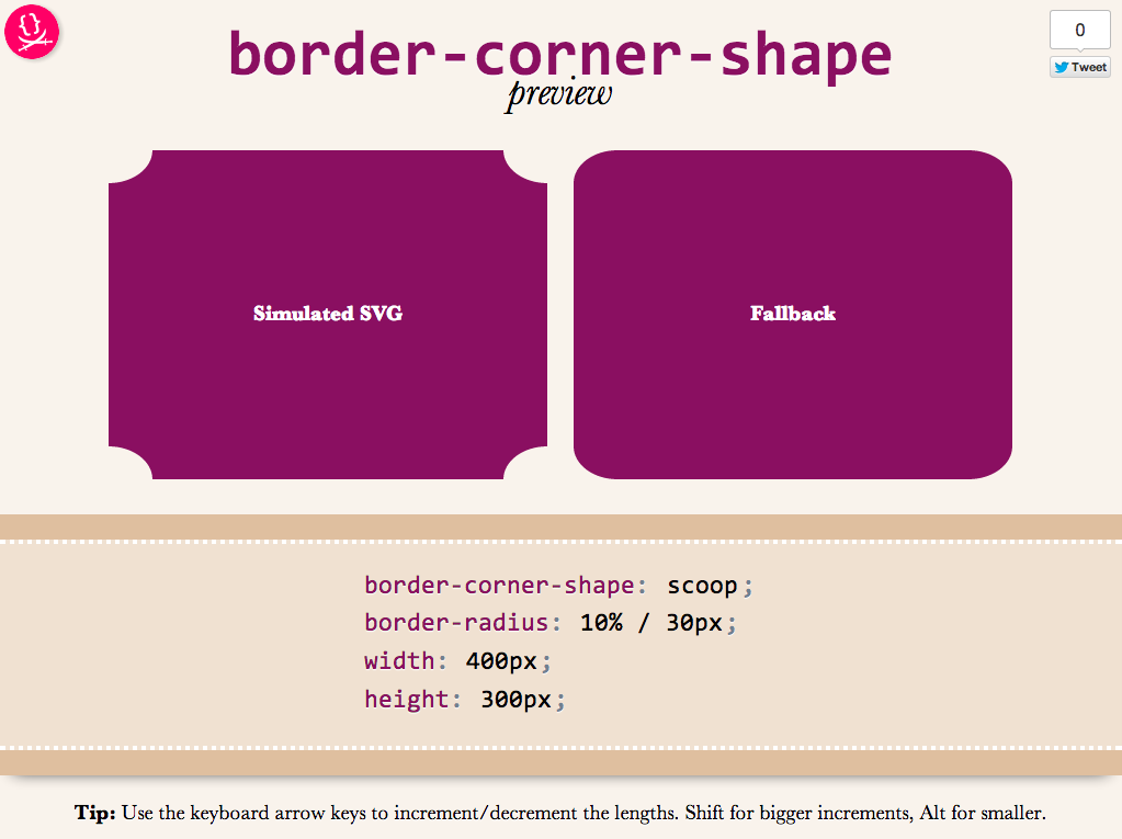
Obviously, it’s not a full preview, since you can only play with a limited subset of CSS properties, but it should be good for seeing the kinds of shapes that will be possible.You could also copy the generated SVG from the Developer tools of your browser, and use it as a background in any website!
Use it here: corner-shape preview
Tested to work in at least Chrome, IE9, Firefox, Safari and theoretically, should work in any SVG-enabled browser.
Enjoy! Hope you like it.
Important: Please note that corner-shape is still at a very early stage and might completely change before implementations. You can also help to make it better: Play with it and comment on what you think about its naming and functionality!
Use MathML today, with CSS fallback!
These days, I’m working on the slides for my next talk, “The humble border-radius”. It will be about how much work is put into CSS features that superficially look as simple as border-radius, as well as what advances are in store for it in CSS Backgrounds & Borders 4 (of which I’m an editor). It will be fantastic and you should come, but this post is not about my talk.
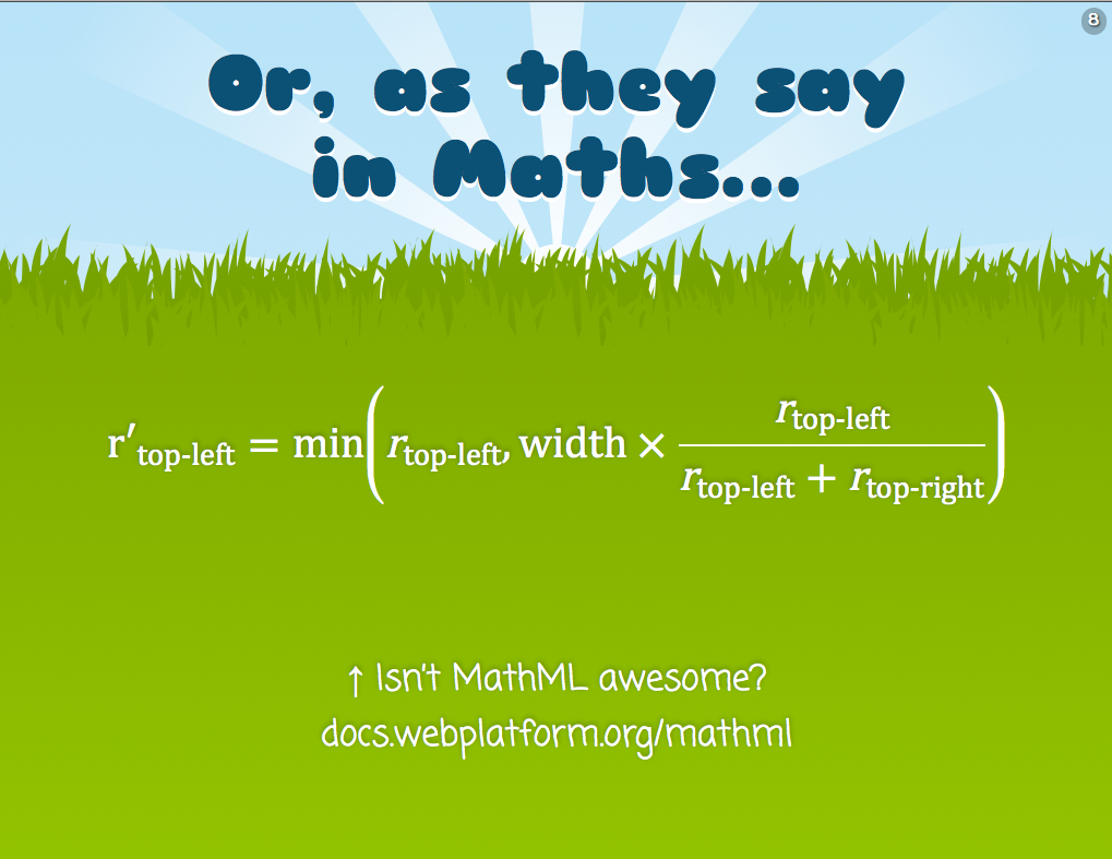
As you may know, my slides are made with HTML, CSS & JavaScript. At some point, I wanted to insert an equation to show how border-top-left-radius (as an example) shrinks proportionally when the sum of radii on the top side exceeds the width of the element. I don’t like LaTeX because it produces bitmap images that don’t scale and is inaccessible. The obvious open standard to use was MathML, and it can even be directly embedded in HTML5 without all the XML cruft, just like SVG. I had never written MathML before, but after a bit of reading and poking around existing samples, I managed to write the following MathML code:
<math display="block">
<mrow>
<msub>
<mi>r′</mi>
<mi>top-left</mi>
</msub>
<mo>=</mo>
<mi>min</mi>
<mo>(</mo>
<msub>
<mi>r</mi>
<mrow>
<mi>top-left</mi>
</mrow>
</msub>
<mo>,</mo>
<mi>width</mi>
<mo>×</mo>
<mfrac>
<mrow>
<msub>
<mi>r</mi>
<mi>top-left</mi>
</msub>
</mrow>
<mrow>
<msub>
<mi>r</mi>
<mi>top-left</mi>
</msub>
<mo>+</mo>
<msub>
<mi>r</mi>
<mi>top-right</mi>
</msub>
</mrow>
</mfrac>
<mo>)</mo>
</mrow>
</math>
I was very proud of myself. My first MathML equation! It’s actually pretty simple when you get the hang of it: <mi> is for identifiers, <mo> for operators and those are used everywhere. For more complex stuff, there’s <mfrac> for fractions (along with <mrow> to denote the rows), <msqrt> for square roots and so on.
It looked very nice on Firefox, especially after I applied Cambria Math to it instead of the default Times-ish font:
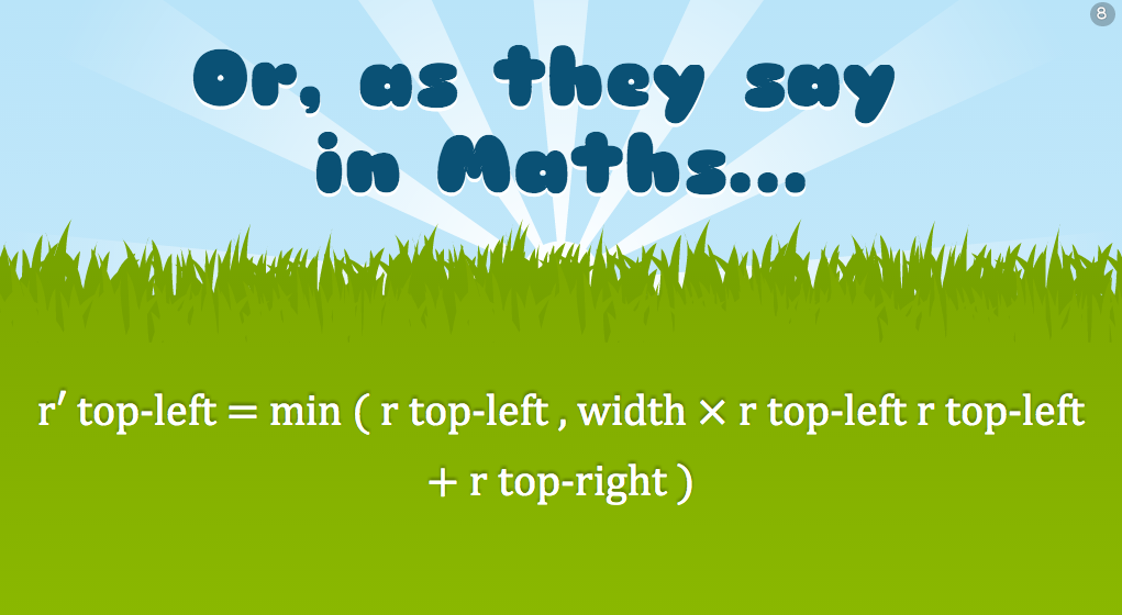
However, I soon realized that as awesome as MathML might be, not not all browsers had seen the light. IE10 and Chrome are the most notable offenders. It looked like an unreadable mess in Chrome:
There are libraries to make it work cross-browser, the most popular of which is MathJax. However, this was pretty big for my needs, I just wanted one simple equation in one goddamn slide. It would be like using a chainsaw to cut a slice of bread!
The solution I decided to go with was to use Modernizr to detect MathML support, since apparently it’s not simple at all. Then, I used the .no-mathml class in conjunction with selectors that target the MathML elements, to mimic proper styling with simple CSS. It’s not a complete CSS library by any means, I just covered what I needed for that particular equation and tried to write it in a generic way, so that if I need it in future equations, I only have to add rules. Here’s a screenshot of the result in Chrome:
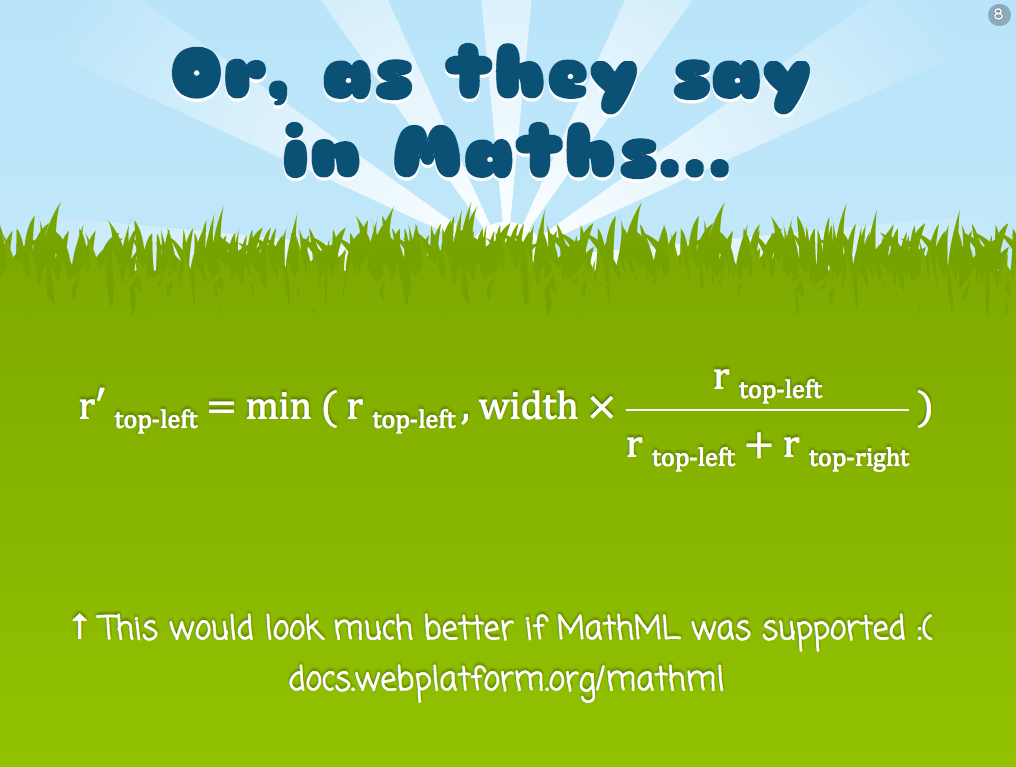
It doesn’t look as good as Firefox, but it’s decent. You can see the CSS rules I used in the following Dabblet:
Obviously it’s not a complete MathML-to-CSS library, if one is even possible, but it works well for my use case. If I have to use more MathML features, I’d write more CSS rules. The intention of this post is not to provide a CSS framework to use as a MathML fallback, but to show you a solution you could adapt to your needs. Hope it helps!
Use MathML today, with CSS fallback!
These days, I’m working on the slides for my next talk, “The humble border-radius”. It will be about how much work is put into CSS features that superficially look as simple as border-radius, as well as what advances are in store for it in CSS Backgrounds & Borders 4 (of which I’m an editor). It will be fantastic and you should come, but this post is not about my talk.
As you may know, my slides are made with HTML, CSS & JavaScript. At some point, I wanted to insert an equation to show how border-top-left-radius (as an example) shrinks proportionally when the sum of radii on the top side exceeds the width of the element. I don’t like LaTeX because it produces bitmap images that don’t scale and is inaccessible. The obvious open standard to use was MathML, and it can even be directly embedded in HTML5 without all the XML cruft, just like SVG. I had never written MathML before, but after a bit of reading and poking around existing samples, I managed to write the following MathML code:
<math display="block">
<mrow>
<msub>
<mi>r′</mi>
<mi>top-left</mi>
</msub>
<mo>=</mo>
<mi>min</mi>
<mo>(</mo>
<msub>
<mi>r</mi>
<mrow>
<mi>top-left</mi>
</mrow>
</msub>
<mo>,</mo>
<mi>width</mi>
<mo>×</mo>
<mfrac>
<mrow>
<msub>
<mi>r</mi>
<mi>top-left</mi>
</msub>
</mrow>
<mrow>
<msub>
<mi>r</mi>
<mi>top-left</mi>
</msub>
<mo>+</mo>
<msub>
<mi>r</mi>
<mi>top-right</mi>
</msub>
</mrow>
</mfrac>
<mo>)</mo>
</mrow>
</math>
I was very proud of myself. My first MathML equation! It’s actually pretty simple when you get the hang of it: <mi> is for identifiers, <mo> for operators and those are used everywhere. For more complex stuff, there’s <mfrac> for fractions (along with <mrow> to denote the rows), <msqrt> for square roots and so on.
It looked very nice on Firefox, especially after I applied Cambria Math to it instead of the default Times-ish font:
However, I soon realized that as awesome as MathML might be, not not all browsers had seen the light. IE10 and Chrome are the most notable offenders. It looked like an unreadable mess in Chrome:
There are libraries to make it work cross-browser, the most popular of which is MathJax. However, this was pretty big for my needs, I just wanted one simple equation in one goddamn slide. It would be like using a chainsaw to cut a slice of bread!
The solution I decided to go with was to use Modernizr to detect MathML support, since apparently it’s not simple at all. Then, I used the .no-mathml class in conjunction with selectors that target the MathML elements, to mimic proper styling with simple CSS. It’s not a complete CSS library by any means, I just covered what I needed for that particular equation and tried to write it in a generic way, so that if I need it in future equations, I only have to add rules. Here’s a screenshot of the result in Chrome:
It doesn’t look as good as Firefox, but it’s decent. You can see the CSS rules I used in the following Dabblet:
Obviously it’s not a complete MathML-to-CSS library, if one is even possible, but it works well for my use case. If I have to use more MathML features, I’d write more CSS rules. The intention of this post is not to provide a CSS framework to use as a MathML fallback, but to show you a solution you could adapt to your needs. Hope it helps!
iOS 6 switch style checkboxes with pure CSS
I recently found myself looking at the Tools switch in Espresso:

Not because I was going to use it (I rarely do), but because I started wondering what would be the best way to replicate this effect in CSS. I set on to create something that adhered to the following rules:
- It should be keyboard accessible
- It should work in as many browsers as possible and degrade gracefully to a plain checkbox in the rest
- It shouldn’t depend on pseudo-elements in replaced elements (such as checkboxes), since that’s non-standard so not very dependable
- It shouldn’t require any extra HTML elements
- It shouldn’t use JS, unless perhaps to generate HTML that could be written by hand if the author wishes to do so.
Why you may ask? Some of them are good practices in general, and the rest make it easier to reuse the component (and they made it more challenging too!).
The best idea I came up with was to use a radial gradient for the knob and animate its background-position. All that on a checkbox. After a lot of tweaking, I settled on something that looked decent (although not as good as the Espresso one) in the browser I was using (Chrome) and went ahead to test it in others. The result was disappointing: I had forgotten that not all browsers allow that kind of customization on checkboxes. And who can blame them? This is what happens when you’re wandering in Undefined Behavior Land. They are not violating any spec, because there is no spec mandating or forbidding checkboxes from being stylable with CSS and to what extent, so every browser does its thing there.
Here you can see my failed attempt, which only works as intended in Chrome:
I realized I had to lift one of the restrictions if I wanted to solve this, so I picked the 4th (no extra HTML elements), as it was the least important one. I could have done it as a pseudoelements on <label>s, but I decided to use a <div> instead, for maximum flexibility. The <div> is added through script in the Dabblet below, but it could be added by hand instead.
To get around the limitation of pseudo-elements not being animatable in current and older versions of WebKit, I animate the padding of the <div> instead.
And then I thought, why not make iOS-style switches? Even more challenging! I turned on my iPhone and tried to replicate the look. Adding the ON/OFF text was very painful, as it needs to both animate and be styled differently for “ON” and “OFF”. Eventually, I ended up doing it with text-indent in such a way that it depends on the knob’s position, so that when the knob animates, the text moves too.
Another challenge with this was the different backgrounds. Changing the background color upon :checked was not enough, since it needs to slide as well, not just abruptly change or fade in. I ended up doing it with a gradient and animating its background-position. Naturally, this makes it not look as good in IE9.
So, without further ado, here is the final result:
Yes, I know there are other efforts on the web to replicate this effect with pure CSS, but none of them seems to come as close to the original, without images and with such minimal HTML.
Why bother, you may ask? Well, it was a fun pastime during SXSW breaks or sessions that turned out to be less interesting than expected or in the plane on the way home. Besides, I think that it could be useful in some cases, perhaps if the styling is tweaked to not resemble iOS too obviously or maybe in iOS app mockups or something.
Enjoy!
Credits to Ryan Seddon for paving the way for custom form elements through CSS, a couple years ago