Reading List
The most recent articles from a list of feeds I subscribe to.
Can we get rid of gradient prefixes?
I recently realized that unprefixed gradients finally propagated to stable Chrome, and after tweeting about it, I decided to do some research on which browsers support unprefixed gradients, and what percentage of users needs them.
Currently, unprefixed gradients are supported in:
- Chrome 26+
- Firefox 16+
- Opera 12.10+
- IE10+
Lets have a look at which prefixes we actually need to use for gradients today.
-ms-
There was never a stable release of IE that supported -ms- prefixed gradients, those were only in preview versions (stable IE10 supports both prefixed and unprefixed gradients). So, -ms- is most definitely not required.
-moz-
Firefox versions >= 3.6 and < 16 account for 4% of the global user base*. This might or might not be significant, depending on how good the fallback is that these users will see. If the gradient only adds a subtle shadow or something like that, I’d say ditch -moz-. If it’s more crucial to the design & branding, it might be wise to still keep it. More tech-focused websites probably have a much lower percentage than 4%, so it might be a good idea to drop it there completely.
-o-
Opera unprefixed gradients in 12.10. Opera Mini never supported them. Opera versions < 12.10 currently account to a total of 0.25% of the global user base*. I’d say it’s safe to ditch -o- in gradients in most cases.
-webkit-
Chrome only very recently unprefixed gradients and Safari is a long way from doing so. Not to mention all the mobile browsers using WebKit. Unfortunately, we can’t ditch -webkit- in CSS gradients just yet.
My opinion
Don’t use -ms- prefixed gradients, there’s absolutely zero point in doing so. Include -moz- for the less subtle gradients. No significant need for -o- gradients. -webkit- is still needed and probably will be at least until the end of 2013. Or, of course, just use -prefix-free and don’t bother. :P
Keep in mind that your stats might differ from global stats, so which prefixes you need to include might differ on a case by case basis. The purpose of this post is to alert you that maybe you don’t need all these prefixes, not to prescriptively tell you which ones to keep. Except -ms-, please don’t use that. There’s absolutely zero reason whatsoever.
Last but not least, no matter which prefixes you include, always have a good solid color fallback!
* Global market share statistics from StatCounter, for a 3 month period of January 2013 - March 2013. The graph on the website only displays the most popular browser versions, but downloading the CSV file gives you all of them.
border-corner-shape is in danger, and you can help!
Remember my previous post about an app I made to preview border-corner-shape? It stirred a lot of discussion in the CSS WG, and David Baron posted this:
http://dev.w3.org/csswg/css4-background/#border-corner-shape appears to me to be an example of a feature that’s addressing a problem that we don’t have – or at least that we don’t have enough to be worth adding such a feature. I think it should be removed.
In particular, if there were demand for the bevel | curve | notch values, we’d be seeing authors using the equivalents of such values on significant numbers of Web sites. So before agreeing to accept this new feature, I’d like to see examples of Web sites that are doing what these values would do. Not something similar to what these values would do, but exactly what these values would do, or at least close enough that the author wouldn’t care about the difference.
You can read the whole discussion in the thread I linked to, above.
I might be wrong, but I believe border-corner-shape would greatly simplify many common effects, especially its “bevel” value, which can even create triangles and other polygons, that we go to great lengths to make with CSS today, and it would degrade much more nicely than border-image or backgrounds. I think it was one of fantasai’s many great ideas and I’m glad she added it to the Editor’s Draft of Backgrounds & Borders 4.
I posted a list of tutorials and questions from web designers & developers, to illustrate that these effects are needed. However, David argued that “Questions from authors don’t give you enough information to be sure that the feature being added is sufficient for the author’s needs”. He did have a point, so with some help from the community, I posted a few links to websites using such effects, and use cases. Nicole Sullivan, Liam Quin, fantasai and Lev Solntsev posted a couple more.
However, the more real examples we have, the more likely it is to retain the feature in some form. This is where you come in: If you think border-corner-shape has merit, provide use cases, either by links to websites whose design elements it would simplify, screenshots of websites or descriptions of cases where you needed such a thing (in that order of preference). You can either post to the thread directly, or comment here and I’ll post them to the list in batches.
If you think it has merit but it could be improved, feel free to post about that as well. If you don’t think it’s a good idea, any alternatives you can think of are welcome as well. Or, if you don’t think it’s useful, say that too (but make sure you first fully understand what it can do). If you’re not sure how it can be used, play around with the demo app I made and be creative!
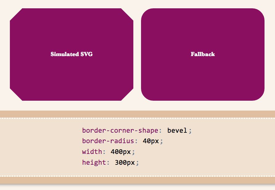
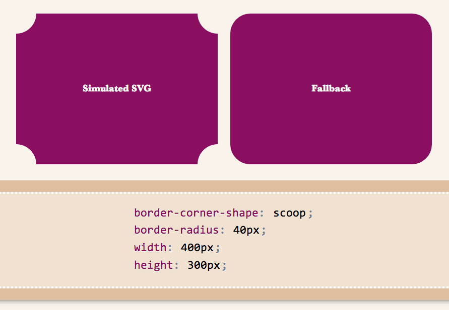
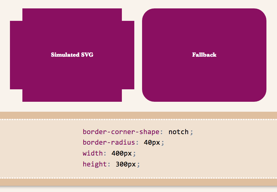
Below are a few examples of shapes:
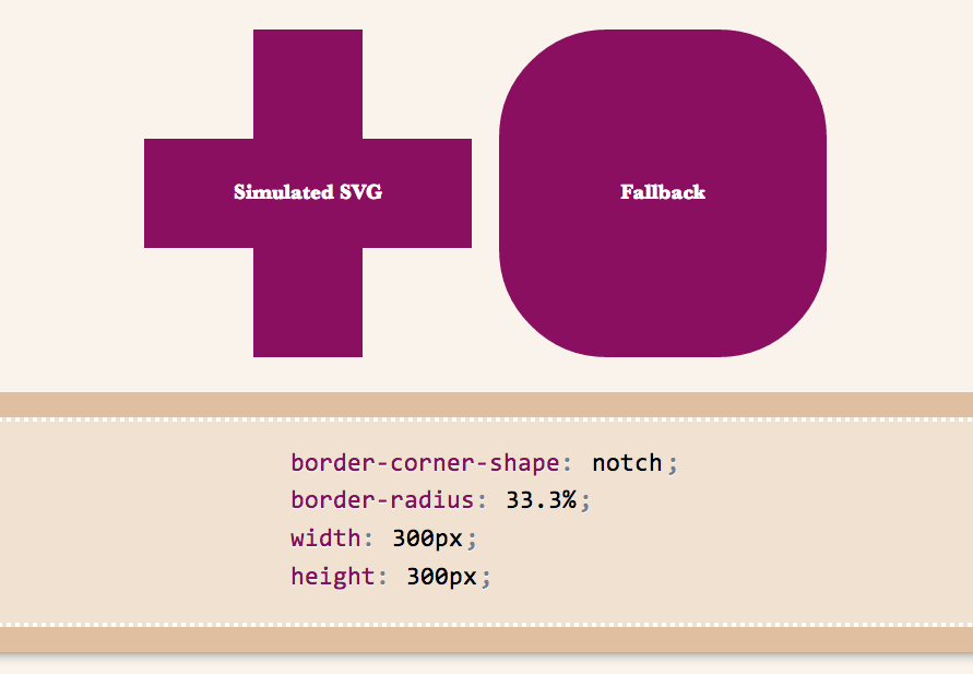
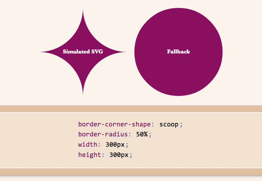
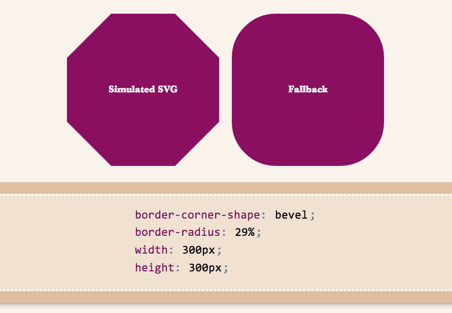
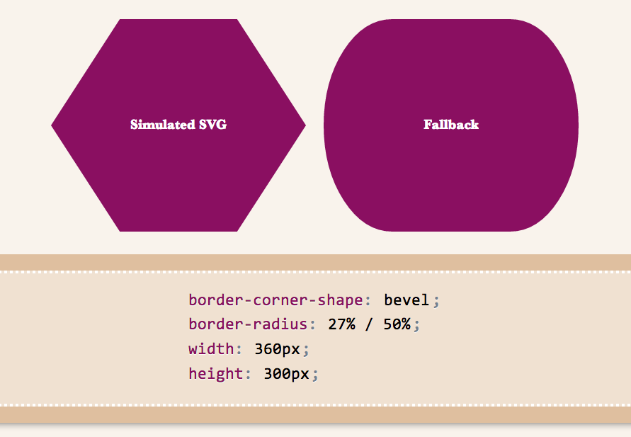
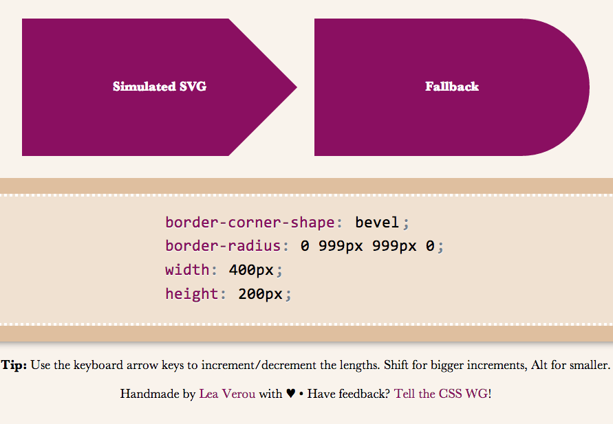
I wanted to demo triangles and trapezoids as well, but it seems there’s a bug in my app, so I’ll have to debug it first :( If we allow border-corner-shape to have different values for all four corners, even more possibilites open (e.g. arrows).
Spend a few minutes to help the CSS WG help you. Thanks!
border-corner-shape is in danger, and you can help!
Remember my previous post about an app I made to preview border-corner-shape? It stirred a lot of discussion in the CSS WG, and David Baron posted this:
http://dev.w3.org/csswg/css4-background/#border-corner-shape appears to me to be an example of a feature that’s addressing a problem that we don’t have – or at least that we don’t have enough to be worth adding such a feature. I think it should be removed.
In particular, if there were demand for the bevel | curve | notch values, we’d be seeing authors using the equivalents of such values on significant numbers of Web sites. So before agreeing to accept this new feature, I’d like to see examples of Web sites that are doing what these values would do. Not something similar to what these values would do, but exactly what these values would do, or at least close enough that the author wouldn’t care about the difference.
You can read the whole discussion in the thread I linked to, above.
I might be wrong, but I believe border-corner-shape would greatly simplify many common effects, especially its “bevel” value, which can even create triangles and other polygons, that we go to great lengths to make with CSS today, and it would degrade much more nicely than border-image or backgrounds. I think it was one of fantasai’s many great ideas and I’m glad she added it to the Editor’s Draft of Backgrounds & Borders 4.
I posted a list of tutorials and questions from web designers & developers, to illustrate that these effects are needed. However, David argued that “Questions from authors don’t give you enough information to be sure that the feature being added is sufficient for the author’s needs”. He did have a point, so with some help from the community, I posted a few links to websites using such effects, and use cases. Nicole Sullivan, Liam Quin, fantasai and Lev Solntsev posted a couple more.
However, the more real examples we have, the more likely it is to retain the feature in some form. This is where you come in: If you think border-corner-shape has merit, provide use cases, either by links to websites whose design elements it would simplify, screenshots of websites or descriptions of cases where you needed such a thing (in that order of preference). You can either post to the thread directly, or comment here and I’ll post them to the list in batches.
If you think it has merit but it could be improved, feel free to post about that as well. If you don’t think it’s a good idea, any alternatives you can think of are welcome as well. Or, if you don’t think it’s useful, say that too (but make sure you first fully understand what it can do). If you’re not sure how it can be used, play around with the demo app I made and be creative!
Below are a few examples of shapes:
I wanted to demo triangles and trapezoids as well, but it seems there’s a bug in my app, so I’ll have to debug it first :( If we allow border-corner-shape to have different values for all four corners, even more possibilites open (e.g. arrows).
Spend a few minutes to help the CSS WG help you. Thanks!
Easily center text vertically, with SVG!
These days, we have a number of different ways to vertically align text in a container of variable dimensions:
- Table display modes
- Flexbox
- inline-block hacks
- Wrapping the text in an extra element and absolutely positioning it
- …and probably many others I’m forgetting
However, often comes a time when neither is suitable, so here I am, adding yet another option to the list. Of course, it comes with its own set of drawbacks, but there are cases where it might be better than the existing solutions.
It all started when I discovered the text-anchor SVG property. It determines where the x and y attributes on <text> elements refer to. The magic starts when you set it to “middle”, then the x and y attributes refer to the center of the text. So, if you set those to 50%, they refer to the center of the SVG graphic itself, and if you set the SVG width and height to 100%, the text basically sits in the center of the <svg>’s container, which could be any HTML element!
One issue was that this centered the baseline of the text, so I tried to find a way to shift the baseline appropriately. Setting dominant-baseline: middle; on the `
In addition, this method has the following drawbacks I can think of:
- Extra markup (namely 2 elements:
<svg>and<text>) - If the text is more than one line, it won’t automatically wrap, you have to do it manually.
- Some new-ish CSS text properties may not be applied. For example, text-shadow is applied in Chrome but not in Firefox, since technically, it’s still not a part of the SVG spec.
- You need to duplicate the text color as a fill property, since SVG does not understand the color CSS property. No need to duplicate anything, just use
fill: currentColor;(thanks GreLI!)
However, it has a few advantages too:
- You don’t need to change anything on the parent HTML element
- Degrades gracefully in non-SVG browsers
- Should be perfectly accessible and won’t break SEO
- Works perfectly in IE9, unlike Flexbox
- You can include any kind of SVG styling on the text. For example, strokes!
You can see and play with the result in the dabblet below:
Verified to work in at least Chrome, Firefox, IE9+. Hope it’s useful, even though it won’t be a good fit in every single use case.
Preview corner-shape, before implementations!
As an editor of the Backgrounds & Borders Level 4 spec, I am naturally a bit more interested in the cool features it will bring, once implementations start (it’s currently too early for that). One of the coolest features in it is corner-shape. While in Backgrounds & Borders 3, border-radius was only used for rounded (actually, elliptical) corners, with the help of corner-shape, it will be able to do so much more! Beveled corners, scoop-style corners (informally known as “negative border-radius”), even rectangular notches.
Unfortunately, until it’s implemented in browsers, it’s hard to play with it. Or, is it? I spent the weekend creating an app in which you can enter values for corner-shape, border-radius, width, and height, and see the result, simulated through SVG, as well as the fallback in browsers that don’t support border-corner-radius (which is currently all browsers).
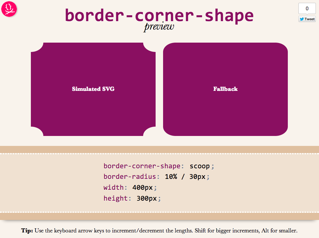
Obviously, it’s not a full preview, since you can only play with a limited subset of CSS properties, but it should be good for seeing the kinds of shapes that will be possible.You could also copy the generated SVG from the Developer tools of your browser, and use it as a background in any website!
Use it here: corner-shape preview
Tested to work in at least Chrome, IE9, Firefox, Safari and theoretically, should work in any SVG-enabled browser.
Enjoy! Hope you like it.
Important: Please note that corner-shape is still at a very early stage and might completely change before implementations. You can also help to make it better: Play with it and comment on what you think about its naming and functionality!