Reading List
The most recent articles from a list of feeds I subscribe to.
An easy notation for grayscale colors
These days, there is a lengthy discussion in the CSS WG about how to name a function that produces shades of gray (from white to black) with varying degrees of transparency, and we need your feedback about which name is easier to use.
The current proposals are:
1. gray(lightness [, alpha])
In this proposal gray(0%) is black, gray(50%) is gray and gray(100%) is white. It also accepts numbers from 0-255 which correspond to rgb(x,x,x) values, so that gray(255) is white and gray(0) is black. It also accepts an optional second argument for alpha transparency, so that gray(0, .5) would be equivalent to rgba(0,0,0,.5).
This is the naming of the function in the current CSS Color Level 4 draft.
2. white(lightness [, alpha])
Its arguments work in the same way as gray(), but it’s consistent with the expectation that function names that accept percentages give the “full effect” at 100%. gray(100%) sounds like a shade of gray, when it’s actually white. white(100%) is white, which might be more consistent with author expectations. Of course, this also accepts alpha transparency, like all the proposals listed here.
3. black(lightness [, alpha])
black() would work in the opposite way: black(0%) would be white, black(100%) would be black and black(50%,.5) would be semi-transparent gray. The idea is that people are familiar thinking that way from grayscale printing.
4. rgb() with one argument and rgba() with two arguments
rgb(x) would be a shorthand to rgb(x, x, x) and rgba(x, y) would be a shorthand to rgba(x, x, x, y). So, rgb(0) would be black and rgb(100%) or rgb(255) would be white. The benefit is that authors are already accustomed to using rgb() for colors, and this would just be a shortcut. However, note how you will need to change the function name to get a semi-transparent version of the color. Also, if in the future one needs to change the color to not be a shade of gray, a function name change is not needed.
I’ve written some SCSS to emulate these functions so you can play with them in your stylesheets and figure out which one is more intuitive. Unfortunately rgb(x)/rgba(x,a) cannot be polyfilled in that way, as that would overwrite the native rgb()/rgba() functions. Which might be an argument against them, as being able to polyfill through a preprocessor is quite a benefit for a new color format IMO.
You can vote here, but that’s mainly for easy vote counting. It’s strongly encouraged that you also leave a comment justifying your opinion, either here or in the list.
Also tl;dr If you can’t be bothered to read the post and understand the proposals well, please, refrain from voting.
Image comparison slider with pure CSS
As a few of you know, I have been spending a good part of this year writing a book for O’Reilly called “CSS Secrets” (preorder here!). I wanted to include a “secret” about the various uses of the resize property, as it’s one of my favorite underdogs, since it rarely gets any love. However, just mentioning the typical use case of improving the UX of text fields didn’t feel like enough of a secret at all. The whole purpose of the book is to get authors to think outside the box about what’s possible with CSS, not to recite widely known applications of CSS features. So I started brainstorming: What else could we do with it?
Then I remembered Dudley’s awesome Before/After image slider from a while ago. While I loved the result, the markup isn’t great and it requires scripting. Also, both images are CSS backgrounds, so for a screen reader, there are no images there. And then it dawned on me: What if I overlaid a <div> on an image and made it horizontally resizable through the resize property? I tried it, and as you can see below, it worked!
The good parts:
- More semantic markup (2 images & 2 divs). If
object-fitwas widely supported, it could even be just one div and two images. - No JS
- Less CSS code
Of course, few things come with no drawbacks. In this case:
- One big drawback is keyboard accessibility. Dudley’s demo uses a range input, so it’s keyboard accessible by design.
- You can only drag from the bottom right corners. In Dudley’s demo, you can click at any point in the slider. And yes, I did try to style ::webkit-resizer and increase its size so that at least it has smoother UX in Webkit. However, no matter what I tried, nothing seemed to work.
Also, none of the two seems to work on mobile.
It might not be perfect, but I thought it’s a pretty cool demo of what’s possible with the resize property, as everybody seems to only use it in textareas and the like, but its potential is much bigger.
And now if you’ll excuse me, I have a chapter to write ;)
Edit: It looks like somebody figured out a similar solution a few months ago, which does manage to make the resizer full height, albeit with less semantic HTML and more flimsy CSS. The main idea is that you use a separate element for the resizing (in this case a textarea) with a height of 15px = the height of the resizer. Then, they apply a scaleY() transform to stretch that 15px to the height of the image. Pretty cool! Unfortunately, it requires hardcoding the image size in the CSS.
Dynamically generated SVG through SASS + A 3D animated RGB cube!
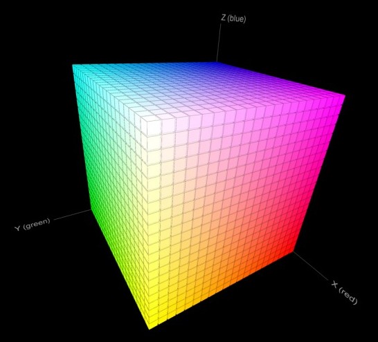
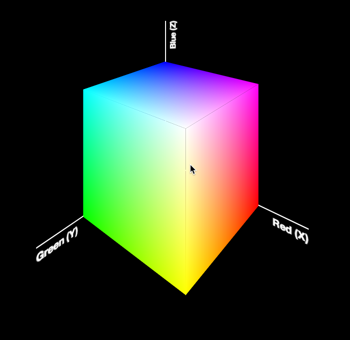 Today, I was giving the opening keynote at Codemania in Auckland, New Zealand. It was a talk about color from a math/dev perspective. It went quite well, despite my complete lack of sleep. I mean that quite literally: I hadn’t slept all night. No, it wasn’t the jetlag or the nervousness that kept me up. It was my late minute decision to replace the static, low-res image of an RGB cube I was using until then with a 3D cube generated with CSS and animated with CSS animations. Next thing I knew, it was light outside and I had to start getting ready. However, I don’t regret literally losing sleep to make a slide that is only shown for 20 seconds at most. Not only it was super fun to develop, but also yielded a few things that I thought were interesting enough to blog about.
The most challenging part wasn’t actually the 3D cube. This has been done tons of times before, it was probably the most common demo for CSS 3D transforms a couple of years ago. The only part of this that could be of interest is that mine only used 2 elements for the cube. This is a dabblet of the cube, without any RGB gradients on it:
The challenging part was creating the gradients for the 6 sides. These are not plain gradients, as you can see below:
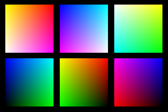 These are basically two linear gradients from left to right, with the topmost one being masked with a gradient from top to bottom. You can use CSS Masking to achieve this (for Chrome/Safari) and SVG Masks for Firefox, but this masks the whole element, which would hide the pseudo-elements needed for the sides. What I needed was masks applied to backgrounds only, not the whole element.
It seemed obvious that the best idea would be to use SVG background images. For example, here is the SVG background needed for the top left one:
<svg xmlns="http://www.w3.org/2000/svg" width="200px" height="200px">

<linearGradient id="yellow-white" x1="0" x2="0" y1="0" y2="1">
	<stop stop-color="yellow" />
	<stop offset="1" stop-color="white" />
</linearGradient>
<linearGradient id="magenta-red" x1="0" x2="0" y1="0" y2="1">
	<stop stop-color="red" />
	<stop offset="1" stop-color="magenta" />
</linearGradient>
<linearGradient id="gradient" x1="0" x2="1" y1="0" y2="0">
	<stop stop-color="white" />
	<stop offset="1" stop-color="black" />
</linearGradient>
<mask id="gradient-mask">
	<rect width="100%" height="100%" fill="url(#gradient)"/>
</mask>

<rect width="100%" height="100%" fill="url(#yellow-white)"/>
<rect width="100%" height="100%" fill="url(#magenta-red)" mask="url(#gradient-mask)"/>

</svg>
However, I didn’t want to have 6 separate SVG files, especially with this kind of repetition (cross-linking to reuse gradients and masks across different files is still fairly buggy in certain browsers). I wanted to be able to edit this straight from my CSS. And then it hit me: I was using SASS already. I could code SASS functions that generate SVG data URIs!
Here’s the set of SVG generating SASS functions I ended up writing:
@function inline-svg($content, $width: $side, $height: $side) {
	@return url('data:image/svg+xml,#{$content}');
}

@function svg-rect($fill, $width: '100%', $height: $width, $x: '0', $y: '0') {
	@return unquote('');
}

@function svg-gradient($id, $color1, $color2, $x1: 0, $x2: 0, $y1: 0, $y2: 1) {
	@return unquote('

	');
}

@function svg-mask($id, $content) {
	@return unquote('#{$content}');
}
And then I was able to generate each RGB plane with another function that made use of them:
@function rgb-plane($c1, $c2, $c3, $c4) {
	@return inline-svg(
		svg-gradient('top', $c1, $c2) +
		svg-gradient('bottom', $c3, $c4) +
		svg-gradient('gradient', white, black, 0, 1, 0, 0) +
		svg-mask('gradient-mask', svg-rect('url(%23gradient)')) +
		svg-rect('url(%23bottom)') +
		svg-rect('url(%23top)" mask="url(%23gradient-mask)')
	);
}

/* ... */

.cube {
	background: rgb-plane(blue, black, aqua, lime);

	&::before {
		background: rgb-plane(blue, fuchsia, aqua, white);
	}

	&::after {
		background: rgb-plane(fuchsia, red, blue, black);
	}
}

.cube .sides {
	background: rgb-plane(yellow, lime, red, black);

	&::before {
		background: rgb-plane(yellow, white, red, fuchsia);
	}

	&::after {
		background: rgb-plane(white, aqua, yellow, lime);
	}
}
However, the same functions can be used for all sorts of SVG backgrounds and it’s very easy to add a new one. E.g. to make polygons:
@function svg-polygon($fill, $points) {
	@return unquote('');
}

@function svg-circle($fill, $r: '50%', $cx: '50%', $cy: '50%') {
	@return unquote('');
}
You can see the whole SCSS file here and its CSS output here.
Warning: Keep in mind that IE9 and some older versions of other browsers have issues with unencoded SVG data URIs. Also, you still need to escape hashes (%23 instead of #), otherwise Firefox fails.
Dynamically generated SVG through SASS + A 3D animated RGB cube!
Today, I was giving the opening keynote at Codemania in Auckland, New Zealand. It was a talk about color from a math/dev perspective. It went quite well, despite my complete lack of sleep. I mean that quite literally: I hadn’t slept all night. No, it wasn’t the jetlag or the nervousness that kept me up. It was my late minute decision to replace the static, low-res image of an RGB cube I was using until then with a 3D cube generated with CSS and animated with CSS animations. Next thing I knew, it was light outside and I had to start getting ready. However, I don’t regret literally losing sleep to make a slide that is only shown for 20 seconds at most. Not only it was super fun to develop, but also yielded a few things that I thought were interesting enough to blog about.
The most challenging part wasn’t actually the 3D cube. This has been done tons of times before, it was probably the most common demo for CSS 3D transforms a couple of years ago. The only part of this that could be of interest is that mine only used 2 elements for the cube. This is a dabblet of the cube, without any RGB gradients on it:
The challenging part was creating the gradients for the 6 sides. These are not plain gradients, as you can see below:
These are basically two linear gradients from left to right, with the topmost one being masked with a gradient from top to bottom. You can use CSS Masking to achieve this (for Chrome/Safari) and SVG Masks for Firefox, but this masks the whole element, which would hide the pseudo-elements needed for the sides. What I needed was masks applied to backgrounds only, not the whole element.
It seemed obvious that the best idea would be to use SVG background images. For example, here is the SVG background needed for the top left one:
<svg xmlns="http://www.w3.org/2000/svg" width="200px" height="200px">

<linearGradient id="yellow-white" x1="0" x2="0" y1="0" y2="1">
	<stop stop-color="yellow" />
	<stop offset="1" stop-color="white" />
</linearGradient>
<linearGradient id="magenta-red" x1="0" x2="0" y1="0" y2="1">
	<stop stop-color="red" />
	<stop offset="1" stop-color="magenta" />
</linearGradient>
<linearGradient id="gradient" x1="0" x2="1" y1="0" y2="0">
	<stop stop-color="white" />
	<stop offset="1" stop-color="black" />
</linearGradient>
<mask id="gradient-mask">
	<rect width="100%" height="100%" fill="url(#gradient)"/>
</mask>

<rect width="100%" height="100%" fill="url(#yellow-white)"/>
<rect width="100%" height="100%" fill="url(#magenta-red)" mask="url(#gradient-mask)"/>

</svg>
However, I didn’t want to have 6 separate SVG files, especially with this kind of repetition (cross-linking to reuse gradients and masks across different files is still fairly buggy in certain browsers). I wanted to be able to edit this straight from my CSS. And then it hit me: I was using SASS already. I could code SASS functions that generate SVG data URIs!
Here’s the set of SVG generating SASS functions I ended up writing:
@function inline-svg($content, $width: $side, $height: $side) {
	@return url('data:image/svg+xml,#{$content}');
}

@function svg-rect($fill, $width: '100%', $height: $width, $x: '0', $y: '0') {
	@return unquote('');
}

@function svg-gradient($id, $color1, $color2, $x1: 0, $x2: 0, $y1: 0, $y2: 1) {
	@return unquote('

	');
}

@function svg-mask($id, $content) {
	@return unquote('#{$content}');
}
And then I was able to generate each RGB plane with another function that made use of them:
@function rgb-plane($c1, $c2, $c3, $c4) {
	@return inline-svg(
		svg-gradient('top', $c1, $c2) +
		svg-gradient('bottom', $c3, $c4) +
		svg-gradient('gradient', white, black, 0, 1, 0, 0) +
		svg-mask('gradient-mask', svg-rect('url(%23gradient)')) +
		svg-rect('url(%23bottom)') +
		svg-rect('url(%23top)" mask="url(%23gradient-mask)')
	);
}

/* ... */

.cube {
	background: rgb-plane(blue, black, aqua, lime);

	&::before {
		background: rgb-plane(blue, fuchsia, aqua, white);
	}

	&::after {
		background: rgb-plane(fuchsia, red, blue, black);
	}
}

.cube .sides {
	background: rgb-plane(yellow, lime, red, black);

	&::before {
		background: rgb-plane(yellow, white, red, fuchsia);
	}

	&::after {
		background: rgb-plane(white, aqua, yellow, lime);
	}
}
However, the same functions can be used for all sorts of SVG backgrounds and it’s very easy to add a new one. E.g. to make polygons:
@function svg-polygon($fill, $points) {
	@return unquote('');
}

@function svg-circle($fill, $r: '50%', $cx: '50%', $cy: '50%') {
	@return unquote('');
}
You can see the whole SCSS file here and its CSS output here.
Warning: Keep in mind that IE9 and some older versions of other browsers have issues with unencoded SVG data URIs. Also, you still need to escape hashes (%23 instead of #), otherwise Firefox fails.