Reading List
The most recent articles from a list of feeds I subscribe to.
The open web, MIDI and assistive tech: State of the Browser 2024
Yesterday, I was at State of the Browser in London. It was great to catch up with friends and make new ones, and the talks were once again very well curated. In this post, I'll share some notes from the day and the takeaways that stood out to me the most.
 The Barbican tube station
Think about funding the web ecosystem
Stephanie Stimac kicked us off with a brilliant talk on how to fund the critical infrastructure that is the web ecosystem. We couldn't browse the web without browsers, and they wouldn't exist without engines, that are hard to make, and to fund. In the current model, browsers get large amounts of money from search deals. For instance, in 2021, Google paid almost 20 billion (not a typo) to Apple to make its search engine the default (but a US federal judge ruled that such payments unlawfully limit competition). It's a lot of money, but as that money goes primarily to the browser companies, not the engines, and may go away if search deals are deemed illegal, we need to think about new ways to fund browser engines, Stephanie urged us. They could include donation based systems, tax breaks or a Web Levy. For more context, see Stephanie's slides and in the comments of w3c/breakouts-day-2024#20.
Participate in accessibility standards
Next up was fashion designer and web accessibility advocate Steve Faulkner. He shared some of his own web standards stories and gave practical tips around how to participate. Without naming (many) names, Steve very accurately explained some of the different types you'll find in standards meetings: there are well-meaning, argumentative, axe to grind, practical, clueless, old school, helpful, true-believing, revisionist and lurking type of people. There are a number of ways people do participate: you can file issues (like in w3c/wcag), comment on issues, file PRs, comment on PRs, join a Community Group or join a Working Group. Only for that very last one, you actually need to represent a W3C Member. What you do need to do, Steve warned, is to know when you don't know. It's fine to just listen before having strong opinions. Now, starting to participate can be hard and/or daunting, so to anyone reading this: feel free to slide in my DM/email, we can (always) use more perspectives.
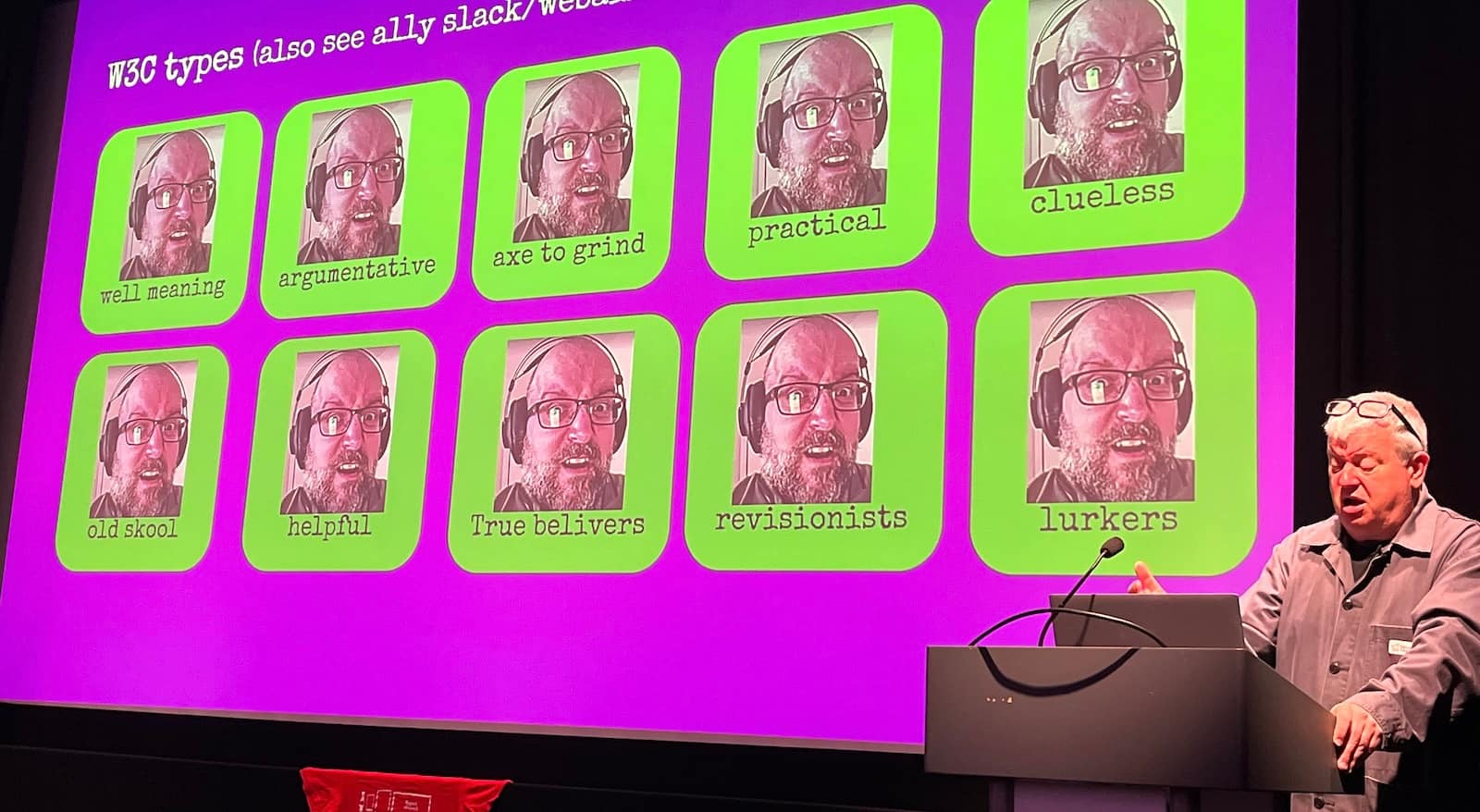 Different types
Advocate for the open web
Stuart Langridge shared the story of how he and others at Open Web Advocacy ended up talking to regulators about anti-competitive behaviour in our industry, including the fact that iOS doesn't allow for other browsers than Safari. Their work has had an enormous impact, as it helped regulators understand the nitty gritty details of what they were regulators. “The web is ours”, Stuart said and anyone who believes the same can join and help out at Open Web Advocacy, or do their own advocacy for an open web. Amen to that!
Make impact
Gayle Ngozi shared how the non-profit Code your Future works with refugees and disadvantaged people to get skills in software engineering to close the gap between them and the job market, specifically in the tech industry. She said we can all make impact by contributing stuff like laptops, time by teaching and/or opportunities by working together to launch new tech careers.
Make little web components
Personal website innovator David Darnes finally explained the inner workings of that cool button on his site that announces his name spoken by different people every time you press it. He didn't cover why it has a bias towards his father's recording, but it was very interesting nonetheless. There's one component that upgrades the standard <audio> element to be a fancy button, another that randomises the source used and one more that makes the playing state available as an attribute so that it can be used in styles. Are Web Components just for little bits? No, Dave showed that it's also used in fairly complex applications he worked on, including at Nordhealth, that has both Nuxt and Django apps using the same components. The technology, Dave said, works so well because is versatile and forgiving.
Make standards open
Katie Fenn is a huge Daft Punk fan, so she used her talk slot to play their “Around the world” with web technologies: the WebMIDI and WebAudio APIs specifically. MIDI is a technology and technical standard specced in the 80s that allows you to pass messages and information between musical instruments, like notes and special effects. Because it was, just like the W3C's web standards, completely open and royalty-free, it's changed music production forever, especially electronic music: yay open standards. You should watch this talk when it comes out. I can't wait to go play with the MIDI-enabled devices in my home.
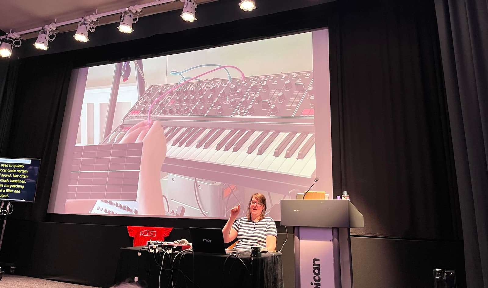 Synthesisers!
Automate more of assistive technology support testing
Lola Odelola showed how web standards work happens by using the ARIA-AT program (and ghost detection 👻) as an example. Many developers will be familiar with the ARIA Authoring Practices Guide. I am very happy for this to exist, but also see gaps in user testing (do real users actually; understand how to use the patterns?) and AT testing (do the patterns work in AT and is that consistent?). ARIA-AT, Lola showed, addresses the latter, and does so really well: there is a Selenium-like protocol called AT Driver to automatically test how the ARIA patterns work in different assistive technologies, with lots of reports as a result. Loved hearing Lola talk about this important project, that I hope can be built out further.
Use fluid scales
Richard Ruttter showed us how to use fluid scales for typography and spacing, I feel inspired to go and try that out on this website when I get a chance. See also what I wrote about that talk at Patterns Day.
Summing up
It was a lovely day, with great talks and conversations. One of the recurring themes was how much extreme capitalism affects the ecosystem we all clearly share a love for, we learned about various concrete ways in which this is at play. At the same time, we shouldn't forget to focus on what is valuable in and of itself: making music, fun buttons and UIs that include everyone. Priorities matter!
Originally posted as The open web, MIDI and assistive tech: State of the Browser 2024 on Hidde's blog.
Comparing design systems to find the best qualities
It's not easy to build very good UI components. A global effort to try and find the best qualities of components would be a great opportunity to improve components everywhere.
Aren't design systems ultimately a quest to collect the best UI practices across an organisation? Or across multiple organisations, or for anyone in general. This kind of work brings excellent opportunities to improve quality across some scope, organisationally or more widely. And if we do that, why not try and aim for the widest possible scope and go global? In A Global Design System, Brad Frost suggests this:
let’s redirect that rallying cry outside of any individual organizations’ walls and apply it to the world at large.
I can only agree with that. With so many design systems out there, it makes a lot of sense to look at the commonalities between them.
As Brad mentions, we've been doing this at Open UI. The goal of this group is to make it easier for developers to build and style UI controls on the web, by improving the web technologies and standards that they are built with. So far, this lead to features like popover (in Baseline today) and styleable selects (in active development).
How a global design system might work
Brad suggested in his post that we could work towards “common library containing common UI components”, with code and designs and documentation. In his follow up, Greg Whitworth suggests to create a test suite. I like how concrete these ideas are, and I am sure they will help tonnes of developers make better components. But what if we look at this idea more a more abstract way?
There are clearly teams who just want to use concrete components, as-is. But in my work and conversations, I hear demand for something else: to have a way to validate what is good. A lot of teams want to build their own components and systems. Or they have to, because of their organisation's specific constraints.
Finding qualities
To me, it seems a lot of developers want acceptance criteria and holistic guidance, rather than built components. There's a lot of example components already, why not try and collect what's already built and seek consensus about what qualities components need?
I'm thinking things like:
- this is how an autocomplete-y combobox should convey new results were filtered
- this is the most user friendly keyboard behavior for switching between tabs
- this type of buttons needs an active verb as the name
This is information that is relatively hard to find, especially for more rare components, and especially in a format that developers can trust to base their decision making on.
In my ideal world, a global design system isn't primarily concerned with making a set of components. Instead, it would focus on finding the best qualities of components. What are the qualities they must have, in order to be solid, accessible, internationalisable, privacy-friendly, secure component?
Benefits
With this approach, these qualities can become checks for everyone who wants to make these components themselves. And at the same time, they can be checks for everyone who wants to quality-assure or accessibility-assess websites that use these patterns. (Plus, folks could still build an example library of components that adhere to the qualities; but I think there are always going to be multiple ways).
Defining qualities rather than concrete components also helps with another problem we've seen at Open UI a lot: that there are many ways that lead to Rome. For example, there are many ways to build a tab. With qualities, we would avoid the search for the true one way to do something. Instead, we could deem multiple implementations of tabs “ok”. The Org X tab is cool, the Org Y is wildly different, but it is also cool, the Org Z tab is… hm, not great, because it lacks a, b and c.
Lastly, it would help with the myth of the accessible component. There is only so much we can build in, there will always be acccessibility considerations that depend on usage (see my talk on built-in accessibility). Both how you use of the component and the context you use it in determine whether the experience is accessible or not. There's no “use this component and your thing will be accessible“. Paraphrasing Scott O'Hara: a component is accessible until you use it somewhere.
What global comparisons unlock
Aren't we lucky that we're now in a phase of design systems that there are a lot to compare between? Comparing different design systems can unlock a number of things, but these are some things I find particularly interesting:
- finding components based on real use cases: if we look at components that already exist, we know someone had a use for them
- finding the best names: naming things is hard, and bringing many design systems together bubbles up which names resonate best with people (see the component matrix and component.gallery)
- getting closer to ‘accessible patterns’: there are lots of things that can make a given pattern more or less accessible; if we bring together patterns from many places, we can document more use cases, more ways people (end users) might use this pattern (accessibility is largely about how people use the web), and more aspects their accessibility specialists have talked about
Each of these is, in its own way, a benefit of including diverse perspectives. Which is what the W3C has been doing for almost (this year!) 30 years.
A national global design system
Brian Kardell shared his idea for moving components through stages. In it, he says:
[a component] would undergo wide review and get some kind of 'verification stamps' for each kind (a11y, i18n, etc).
He suggests folks submit components, that then get reviewed, which will lead to a catalog of components that have been checked and for which everyone can publicly see how many of the checks they meet.
I liked a lot about this proposal and feel it will be fruitful to primarily focus on checks. I also noticed some similarities to what we're doing at NL Design System, a project I'm involved in for the Dutch government, so I wanted to end this post with describing a bit about our process.
At NL Design System, different governmental organisations collaborate on defining the best components, patterns and guidelines. The core team, that I'm a part of, facilitates this collaboration. It may end up being a kind of national global design system, a standard for building good digital government services.
Relay Model
So how do we work? Each organisation in our community has their own design system. In principle, they use a shared architecture, build components that meet their own needs and open source them under the same license. Components that seem suitable for standardisation are put on a track that we call “Relay Model” (see also this excellent presentation on the Relay Model (Dutch, English subtitles available) by my colleague Yolijn van der Kolk).
In relay racing competitions, runners take a baton and hand it over to the next person. With our Relay Model for components, different people can take a component to different stages.
(Note: there are patterns and guidelines too, but here I'll focus on components specifically.)
In this process, components (their “blueprint”, eg “Button”) can have one of four statuses:
- “Help Wanted“: there is agreement on the rationale for the component, organisation(s) that need this can build it.
- “Community”: the component exists in one or more organisations, meets a set of acceptance criteria and uses the shared architecture. Each organisation can build it with the bells and whistles they need.
- “Candidate”: the component meets more acceptance criteria, including strict accessibility and usability tests, and is deemed ready to become the standard, we solicit real-life feedback in a request for comments period. It is stripped of elements that are too organisation-specific.
- “Hall of Fame”: the component is stable, not controversial, and has “guarantees” around reusability, accessibility, usability and stability. This is where a “button” becomes “nl-button”.
There's also two more informal statuses: components that are likely to have just the one use case for one organisation, one-offs, are deemed “Snowflake”, and components that are unlikely to result in accessible, user-friendly components are deemed “Discouraged”.
During any time, components can exist in multiple organisations, so City X, Government Agency Y and Province Z could all have a Button that meet their needs. The “Hall of Fame” Button is the common denominator version of it, where we've tried to remove all the org-specific stuff and stick with features that multiple organisations need. User research is an essential part of all this and we encourage organisations to share theirs as open source Markdown.
Benefits we see include:
- legitimacy: based on the needs of specific organisations and their use cases
- credibility: the components aren't the result of one person or team's opinions; a combination of wide feedback, user research and collaboration are essential in the journey; “blessing a component” is a largely shared responsibility
- open approval process: the criteria and process for moving to the next stage are open (see the GitHub project board for Help Wanted), anyone can steward a component to the next stage, then pass on they if they wanted to
- living standard: teams should always be able to innovate. If they need an extra component or variation, they can always make it available as “Community” even when a similar component already exists in the current “Hall of Fame” standard
We're currently stewarding components through the first stages, and don't have a “Hall of Fame” yet. But the process already demonstrates value today, for everyone involved: teams are using one another's components and are benefiting from each other's perspectives, accessibility knowledge and user research.
Summing up
In conclusion: I think there's a lot of value in trying to find which qualities make for very good components, using a standardisation-like process that involves a broad range of stakeholders and avoids blessing-by-a-few. In my ideal world, this can bring us to a place where web developers can get more confidence in how to make their components very good. Recent conversations within Open UI make me hopeful we'll get closer to that.
Originally posted as Comparing design systems to find the best qualities on Hidde's blog.
On authoring tools in EN 301 549
Today I was at the IAAP-EU event in Paris, where we spent a morning workshopping and clarifying parts of EN 301 549, the procurement standard that is used in the Web Accessibility Directive.
I managed to get a spot in the group that focused on 11.8, the part of EN 301 549 that focuses on authoring tools. In this post, I'll share some insights from that session.
This post was written, as always, in personal capacity. And sorry, I don't have an HTML link for EN 301 549 (there isn't one currently, but there is a PDF).
What actually are authoring tools?
When my job was to promote the use of ATAG, I used to say authoring tools are “tools that create web content”. In EN 301 549, they are defined more broadly, beyond web:
software that can be used to create or modify content
(from EN 301 549, chapter 3: Definition of terms, symbols and abbreviations)
In other words, this definition includes web content as well as non-web content. The EN defines “non-web content” as “not a web page, not embedded in any web pages or used in the rendering or functioning of the page”. Examples of such content includes PDFs, Word documents and EPUB files. There's also a W3C document specifically about accessibility of “non-web content”, WCAG2ICT (which is informative, not normative) .
EN 301 549's authoring tool definition is followed by three notes, that all demonstrate the extent to which these tools exist:
- authoring tools can have multiple users collaborating on content (this makes me think of tools like Sanity Studio or Google Docs where lots of people can edit content at the same time)
- authoring tools could be a collection of multiple applications. For instance, some content goes through multiple applications before end-users access it
- authoring tools could produce content that's used or modified later
In our group we quickly realised that there are indeed a lot of different authoring tools. The most obvious one is Content Management Systems (CMSes). Others that people mentioned are social media, online forums, video editing tools, WYSIWYG editors, and email clients. ATAG at a glance also mentions Learning Management Systems, blogs and wikis. It's a broad category, there are a lot of tools that can make (web) content.
The ATAG reference
ATAG, the Authoring Tool Accessibility Guidelines, is the standard that provides recommendations for both making authoring tools themselves accessible (part A), as well as the content they produce (part B). See my earlier post ATAG: the standard for content creation for an overview.
Conforming with EN 301 549 requires that all of our web pages meet all of WCAG (up to Level AA, see EN 301 549, clause 9.6). But it doesn't require ATAG. ATAG is merely mentioned as something that is worth reading for “those […] who want to go beyond [EN 301 549]” (in 11.8.0). In other words, there is no normative requirement to read it, let alone to apply it.
Still, some CMSes do. For instance, Drupal supports ATAG (part A and B) from version 8. Joomla, Wagtail and Craft CMS also have done a lot of work towards improving accessibility, see the W3C's List of authoring tools that support accessibility.
However, that doesn't mean ATAG isn't an incredibly useful standard for people who make and use authoring tools. In fact, it is. In 11.8.2 to 11.8.5, some ATAG requirements are explicitly added. These clauses are requirements, because they use “shall”, which in ETSI standards implies a “mandatory requirement” (say their drafting rules).
Note: that EN 301 549 requires these things, doesn't mean the law in European countries does. These laws often refer to specific parts of the EN, or refer to EN 301 549 specifically in relation to web content.
Note 2: clause 48 of the Web Accessibility Directive is interesting. It includes various points I'd love to see member states adopt:
- “EU member states should promote the use of authoring tools that allow better implementation of the accessibility requirements set out in this Directive”
- recommendation to “[publish] a list of compatible authoring tools” (as suggestions, so not requiring them specifically)
- recommendation to “fund their development”
11.8.2: “enable” and “guide”
Out of the authoring tool requirements, we talked most about 11.8.2. It says:
Authoring tools shall enable and guide the production of content that conforms to clauses 9 (Web content) or 10 (Non-Web content) as applicable.
The key words to me are enable and guide. My personal interpretation of what that means, and maybe partially what I want it to mean:
- enable: that tools have, for all types of content they can produce, functionality to create any necessary accessibility aspects for that type of content. For instance, if they let you add an image, they need to let you add a text alternative. There's a lot of grey area, because some very complex images might require linked descriptions that don't fit as alternative text. And what about types of content that the tool creator users aren't supposed to create? LinkedIn might say it only lets users create plain text with links, not headings. Is the fact that users will try and add faux bold text and whitespace instead of headings LinkedIn's fault or the user's?
- guide: that tools tell authors about accessibility issues and help them get it right. I would love for more authoring tools to do this (see also my pledge in Your CMS is an accessibility assistant). Let authoring tools guide authors to more accessible content, this should have a large multiplier with fewer barriers across the web as a result.
What I like about the “guide” part especially: it addresses problems where they surface first. It lets authors fix accessibility problems before they ship to production, if the authoring tool guides them.
Other requirements
We didn't get to the other clauses, but they are interesting too:
- preservation of accessibility information in transformation: a real example I dealt with: if you turn HTML into PDFs with PrinceXML, it's tricky to get it to take the text alternatives from your images and embed them correctly into the PDF.
- repair assistance: there are CMSes already that tell authors when they're about to choose a new colour that would cause contrast issues (like WordPress' editor). Again, this lets authors fix problems before they exist in the produced content. Drupal has a list of modules that may improve accessibility.
- templates: when templates are available, accessible ones should be available. Again, a focus on making accessible templates could have a huge multiplier effect, as they could be reused in many different places. WordPress has a list of accessibility themes
Summing up
It was fun to dive into one of the requirements specifically, and my hope is for two things. First, I'd find it useful for there to be more extended guidance on these clauses. They are fairly minimal and more concrete examples would help. Second, the testability could improve. What makes a template an accessible template (one that meets WCAG?), what sort of assistance is sufficient, and what sort of “guiding the author” is? And then my last open question would be: when does an authoring tool fall into or outside of the scope of the organisation trying to comply with EN 301 549? Is this when they use an authoring tool or only when they create one? To be continued!
Originally posted as On authoring tools in EN 301 549 on Hidde's blog.
On popover accessibility: what the browser does and doesn’t do
One of the premises of the new popover attribute is that it comes with general accessibility considerations “built in”. What does “built in accessibility” actually mean for browsers that support popover?
See also: Scott's post Popping preconceived popover ponderings and Hidde's talk on popovers, and other posts about popover semantics, positioning popovers and the difference with dialogs and other components.
About this post
NOTE: except for this note, this whole post was co-written with Scott O’Hara (thanks Scott!). See also Scott's post, popover accessibility and his post Popping preconceived popover ponderings. Whether you're a developer, designer or accessibility specialist, hearing “accessibility is built in” probably makes you want to know what exactly is built-in. For popover, this actually changed quite a bit over time, after discussions at Open UI and with WHATWG. At first, the plan was to introduce a popup element with built-in roles. Later, an attribute ended up making more sense (more on that in the post). For that attribute, and thanks to the great effort of Scott and others, some “accessibility guardrails” have now emerged. And they shipped in most browsers. I hope this post helps you understand better what accessibility is “built-in” when you use popover, and what is not.
In this post
- Accessibility semantics
- What browsers do (aria-expanded, aria-details, group, keyboard accessibility)
- What browsers don't do
- Conclusion
Accessibility semantics
The “built-in” accessibility of popover is in the addition of guardrails: browsers try to improve accessibility where they can. These guardrails exist mostly in the form of browsers augmenting accessibility semantics. Before we get into what those guardrails are, let's clarify what that term means.
Many features of HTML have some amount of accessibility semantics associated with them - e.g., roles, states and properties. This is information that a web page exposes, which browsers then pass on to platform accessibility APIs. They do this, so that assistive technologies can build UIs around them (see: How accessibility trees inform assistive tech). These semantics are sometimes baked into native HTML elements. For instance, headings and lists have implicit roles (heading and list, respectively). Other elements, like the checkbox input type, have an implicit role as well as additional states and properties. Developers can use HTML elements with such “built-in” semantics. But they can also set, overwrite and augment accessibility semantics more directly in their HTML structure, using WAI-ARIA.
The thing with the popover attribute is that it doesn’t have a built-in role. After all, it’s not an element. Its purpose is to only add “popover behaviour”, as discussed in Popover semantics. In that sense, popover is a bit like tabindex or contenteditable. These attributes also add behaviour: tabability and editability behaviours, respectively.
A major reason for this choice is that there are a number of components that exhibit popover behaviours. Examples include menus, “toast” messages, sub-navigation lists of links and tooltips. You can use popover on a specific element, then it will get that element's role. Or you can use it with a generic element, and add a role that best matches what you are building.
So, while the default role is ‘generally’ not handled by the attribute (more on that later), there are other semantics (properties and states) that the attribute will expose. Browsers can take care of those with some degree of confidence.
What browsers do
There are two semantics that the browser should take care of when you use popover, and its associated popovertarget attribute. Additionally, there is some keyboard focus behaviour that may also be handled automatically, depending on the type of popover you are using.
The aria-expanded state
First, aria-expanded. This state is exposed on the element that invokes the popover, currently limited to buttons (for a variety of reasons that would require a whole other article to talk about - so this is all you get right now). When a popover is invoked by / associated with a button with the popovertarget attribute, the browser will automatically convey whether the popover is in the expanded (rendered) state, or if it is in the collapsed (hidden) state. This is implemented in Edge, Chrome, Firefox and Safari.
For the following example, the ‘heyo’ button will automatically convey whether its associated popover list is in the expanded or collapsed state, based on whether the popover list is invoked as a popover.
<button popovertarget=p>
  Heyo
</button>

…

<ul
  aria-label="Heyo subpages"
  id=p
  popover
></ul>
Note: the state won’t be applied if script, rather than the declarative attribute, does the opening on click of any button (or any other element). Needless to say: it also doesn’t work if there isn’t an invoking button, for instance, and script invokes this popover (because in that case, there isn’t any expanding going on). Additionally, if you force open your popover using CSS display block, then it will not be rendered as a popover - and thus the button will still communicate that the “popover” is in the collapsed state. Also, if you’re doing that - forcing your popover open with CSS - maybe you have some things you need to reconsider with your UI.
The aria-details relationship
When the popover doesn’t immediately follow its invoking button in the accessibility tree, browsers are supposed to create an aria-details relationship on the popover’s invoking button with its associated popover. At the time of writing, this is implemented in Chrome, Edge and Firefox.
For instance, in the following markup snippet an implicit aria-details relationship will be made with the button that invokes the popover, because the button and the popover are not immediate siblings in the accessibility tree.
<button popovertarget=foo>something</button>

<p>...</p>

<div role=whatever popover id=foo>...</div>
Similarly, an aria-details relationship will be made with the next markup snippet too, because even though the popover and its invoking button are siblings, the popover is a previous sibling to the invoking element, and it might not be understood which element is the popover, because it doesn’t immediately follow the element that invoked it.
<div role=whatever popover id=foo>...</div>

<button popovertarget=foo>something</button>
In contrast, the next two examples have no aria-details association because that would be unnecessary. For the first, the popover is the immediate next sibling in the accessibility tree (note divs are generic and often ignored when they do not provide information important to accessibility). For the second, the button is a descendant of the popover, so browsers do not need to tell users that the button they are interacting with is about the context they are within. That’d be silly.
<!--
  example 1:
  popover immediate sibling in acc tree
-->
<button popovertarget=m>something</button>
<div class=presentational-styles-only>
  …
  <div role=menu popover id=m>...</div>
</div>

<!--
  example 2:
  button descendant of popoover
-->

<dialog popover id=d>
  <button popovertarget=d>close</button>
  …
</dialog>
For more information on how aria-details works, check out the details in the ARIA spec.
Note: aria-details is often confused with aria-describedby. That makes sense, “details” and “descriptions” are very similar. However, these two properties expose different information. aria-describedby takes the associated element’s content, flattens it into a single text string, and exposes that as the ‘description’ or ‘hint’ of the element which the attribute is specified. In contrast, aria-details only informs a user that there is additional information about the current element. That might not seem useful, until you know that screen readers largely provide quick-keys to navigate to and from that associated element which provides the details.
At the time of writing, navigating into the referenced content using quick-keys is supported by JAWS and NVDA (release notes), but not VoiceOver.
Here’s a quick demo of that with JAWS 2023 in Edge 124. JAWS lets us jump to the details content if we press Alt + Ins + D:
In NVDA (2023.3.4), tested with Edge 124, it works slightly differently: when you press the shortcut (NVDA + D), we don't jump to the details content, but it is read out after the shortcut is pressed:
(see demo on CodePen; note: announcements and shortcuts depend on the user's settings, versions, etc)
In the following demo, you can see how the aria-details relationship works between popovers and their invokers (in JAWS 2023 with Edge 124):
(video contains screenshot of code, see demo on CodePen)
In summary: the aria-details association is not announced by JAWS when we focus the invoking button for the first time. This is because the corresponding popover is hidden, so the association isn't made yet. After we open the popover, JAWS announces the button's “has details” association while it is open, to hear it we navigate away and back. This is also how it works in NVDA, which, in addition, also requires you to switch to forms mode to actually hear the relationship announced.
Warning: even if the aria-details association is implemented, it may not be completely ironed out in how the UX behaves for people. For instance, there isn't currently a way for users to find out about the details relationship once it is established, like when the popover opened. It requires for the user to move away from the button and return to it, at which point the relationship is announced. Maybe it would be helpful if the browser would fire some kind of event, to let AT like JAWS know that an element representing details has appeared.
We mention this not to deter you from using popover or to indicate that anyone is doing something “wrong” here. Rather, this is a relatively new feature that people still need to figure out some of the UX kinks around. Feedback is welcome, and to help ensure the best UX is provided, please reach out to the necessary browsers / AT with your thoughts.
The group role
As mentioned above, popover can be used on any element, including elements that don’t have a built-in role, like div. But even without a role, it’s likely that the contents of a popover form some kind of meaningful whole. This is why in Chrome, Edge and Firefox, a role of group is automatically added to popovers if they would otherwise have no role, or a role of generic (for instance, divs and spans).
The group role is added, so that assistive technology can have the option to expose the boundaries of the popover that is being displayed. This can be important to users, because a popover is a behavior and visual treatment of its content. How is one to know where such content begins or ends if it doesn’t have boundaries to expose?
It’s important to know that an unnamed group is often ignored by screen readers. This is because otherwise the Internet would be riddled with unhelpful “group” announcements. (See also why Webkit made the decision to remove list semantics from lists that have been styled to not look like lists. These topics are related). Here though, it again comes down to what assistive technology wants to do. By exposing the group role for the popover, now the element can be named by authors, which will force the group role to be exposed in most cases. Then, if AT decided they want to do something special for popover groups, they now have the opportunity to do so.
Keyboard accessibility
One more aspect of “built-in accessibility” that browsers do for your popover, is take care of some keyboard behaviors.
Moving focus back to invoking element
Edge/Chrome, Firefox and Safari will all return focus to the invoking element when you close the popover (only if you are inside of it). This is useful, because if focus was on an element inside the popover, the default would be to return focus to the start of the document. Various groups of users would get lost, increasingly so on pages with a lot of content. Moving focus back to the invoking element helps ensure people can quickly return to what they were doing, rather than spending time having to re-navigate to where they think they were last.
Popover content in tab order
Desktop browsers also do something else: they add the popover content into the tab order just after the invoking button. Even if that’s not where the popover is in the DOM.
Imagine this DOM structure:
<button popovertarget=p>Open popover</button>

<p>content… content… <a href="#">link 1</a></p>

<p>content… content… <a href="#">link 2</a></p>

<div popover id="p"><a href="#">link 3</a></div>
When the popover opens, and you press Tab, you might think you’d jump to “link 1”, the next interactive element in the DOM. Except, in desktop browsers, you will jump to “link 3” instead. The browser basically moves the popover content’s position in tab order to just after its invoking button. This takes it out of its expected position in the tab order. That improves the user experience, because it is likely that upon opening the popover, users will want to interact with its contents.
Keep in mind: browsers adjust the Tab order for instances like this, but they don't adjust the placement of the content in the accessibility tree. This is why the aria-details association was implemented. This special Tab order behavior helps ensure logical focus order for keyboard accessibility. However, we should still strive to make sure our popovers come after the invoking element in the DOM.
But since there will be times where the exact location of the popover in the DOM may be out of one’s control, this behavior is still quite welcome. For instance, if the popover happens to be far away in the DOM, having to go through the rest of the document before reaching the popover would be a nuisance. It would be highly unexpected and unwanted to have to navigate through all other focusable elements in the DOM, prior to the popover one just opened. WCAG 2.4.3 Focus Order requires focusable elements to receive focus in an order that “preserves meaning and operability”. This special browser Tab restructuring helps ensure that requirement can be met.
What browsers don’t do
We can keep this one short: the browser will not do anything apart from the behaviours listed above. Browsers will not add behaviors based on which elements you use or which role you add to them. The popover attribute is merely a first step for us to build new components.
Conclusion
The popover attribute provides a starting point for building popover-like interactions on the web. Browsers don't magically make your components accessible, that's not a thing. But there are some specific keyboard behaviours included with popover, as well as these semantics:
- In specific cases, browsers set the
aria-expandedstate and/or set thearia-detailsrelationship on the invoker. - Browsers apply the
grouprole to thepopovercontent if it doesn’t have a role of its own, so that assistive technologies can expose their boundaries.
Browser support note: at the time of writing, Safari only sets aria-expanded, not aria-details. It also doesn't add a group role fallback.
Originally posted as On popover accessibility: what the browser does and doesn’t do on Hidde's blog.
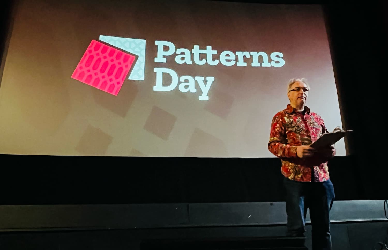
Breadcrumbs, buttons and buy-in: Patterns Day 3
Yesterday I spent all day in a cinema full of design system nerds. Why? To attend Patterns Day 3. Eight speakers shared their knowledge: some zoomed out to see the bigger picture, others zoomed in on the nitty-gritty.
It was nice to be at another Patterns Day, after I attended the first and missed the second. Thanks Clearleft and especially Jeremy Keith for putting it together. In this post, I'll share my takeaways from the talks, in four themes: the design system practice, accessibility, the technical nitty-gritty, and communication.
 The day's venue: the Duke of York's cinema
The design system practice
Design system veteran Jina Anne, inventor of design tokens, opened the day with a reflection on over a decade of design systems (“how many times can I design a button in my career?”) and a look at the future. She proposed we find a balance between standardisation and what she called “intelligent personalisation”.
On the other hand, we aren't really done yet. There are so many complex UX patterns that can be solved more elegantly, as Vitaly Friedman showed. His hobbies include browsing postal office, governmental and e-commerce websites. He looks at the UIs they invent (so that we don't have to). Vitaly showed us more breadcrumbs than was necessary, including some that, interestingly, have feature-parity with meganavs.
Yolijn van der Kolk, product manager (and my colleague) at NL Design System, presented a unique way of approaching the design system practice: the “relay model”. It assigns four statuses to components and guidelines, which change over time on their road to standardisation. It allows innovation and collaboration from teams with wildly different needs in wildly different organisations. The statuses go from sharing a need (“Help Wanted”), to materialising it with a common architecture and guidelines (“Community”), to proposing it for real-life feedback (“Candidate”), to ultimately standardising an uncontroversial and well-tested version of it (”Hall of Fame”).
 Jeremy Keith hosted the event
The technical nitty gritty
Two talks focused on design problems that can be solved with clever technical solutions: theming (through design tokens) and typography (through modular scales with modern CSS).
Débora Ornellas, who worked at Lego (haven't we all used the analogy?), shared a number of great recommendations around using design tokens: to use readily available open source products instead of inventing your own, publish tokens as packages and version them and avoid migration fatigue by reducing breaking changes.
Richard Rutter of Clearleft introduced us to typographic scales, which, he explained, are like musical scales. I liked how, after he talked about jazz for a bit, the venue played jazz in the break after his talk. He showed that contrast (eg in size) between elements is essential for good typography: it helps readers understand information hierarchy. How much depends on various factors, like screen size, but to avoid having to maintain many different scales, he proposed a typographic scale that avoids breakpoints, by using modern CSS features like clamp() (or a CSS locks based alternative if you don't want to risk failing WCAG 1.4.4). I suggest checking out Utopia to see both strategies in action.
Accessibility, magic and the design system
The power of design systems is that they can make it easier to repeat good things, such as well-engineered components. And they can repeat accessibility, but there is a lot of nuance, because that won't work magically.
Geri Reid (seriously, more conference organisers should invite Geri!) warned us about the notion that a design system will “fix” the accessibility of whichever system consumes it. Sounds like magic, and too good to be true? Yup, because what will inevitably happen, Geri explained, is that teams start using the “accessible” components to make inaccessible things. Yup, I have definitely seen this over and over.
To mitigate this risk of “wrong usage”, she explained, we need design systems to not just deliver components, but set standards and do education, too. At which point the design system can actually help build more accessible sites. For instance, if components contain ARIA, it's essential that the consumers of those components know how to configure that ARIA. In other words, design systems need very good documentation. Which brings me to the last theme: common understanding and why it matters.
Mitigating misunderstandings with better communication
The theme that stood out to me on the day: design system teams commonly have to deal with misunderstandings. Good communication is important. What a cliché, you might say, that's like anyone in any job. Yes, but it's specifically true for our field: design systems force collaboration between such a broad range of people. That includes similar-discipline-collaboration, like between designer and developer. Débora explained what can happen if they don't work together closely, or if breaking changes aren't communicated timely.
But it's also about wider collaboration: a design system team also needs to make sense to other departments, that have specific requirements and norms. Including those that don't really grasp all the technical details of front-end componentisation, like marketing or (non-web) brand teams, or the people who can help sponsor or promote the project. Samantha Fanning from UCL focused on this in her talk on “design system buy-in”, which she had a lot of useful tips about. She recommended to involve other departments early to do “co-design” rather than presenting (and surprising) them with a finished product. She also shared how it helped her to add design system work as extra scope onto existing projects, rather than setting up a design system specific project.
In her talk, Mary Goldservant of the Financial Times, also touched on the importance of communication. She shared how they got feedback from stakeholders and manage expectations, while working on a large update to Origami, the Financial Times' brilliantly named design system, that includes lots of changes, like multi-brand and multi-platform support.
Wrapping up
It was nice to hang out with so many like-minded folks and learn from them. A lot of the challenges, tools and ideas resonated. Once again, I've realised our problems aren't unique and many of us are in similar struggles, just in slightly different ways.
Originally posted as Breadcrumbs, buttons and buy-in: Patterns Day 3 on Hidde's blog.